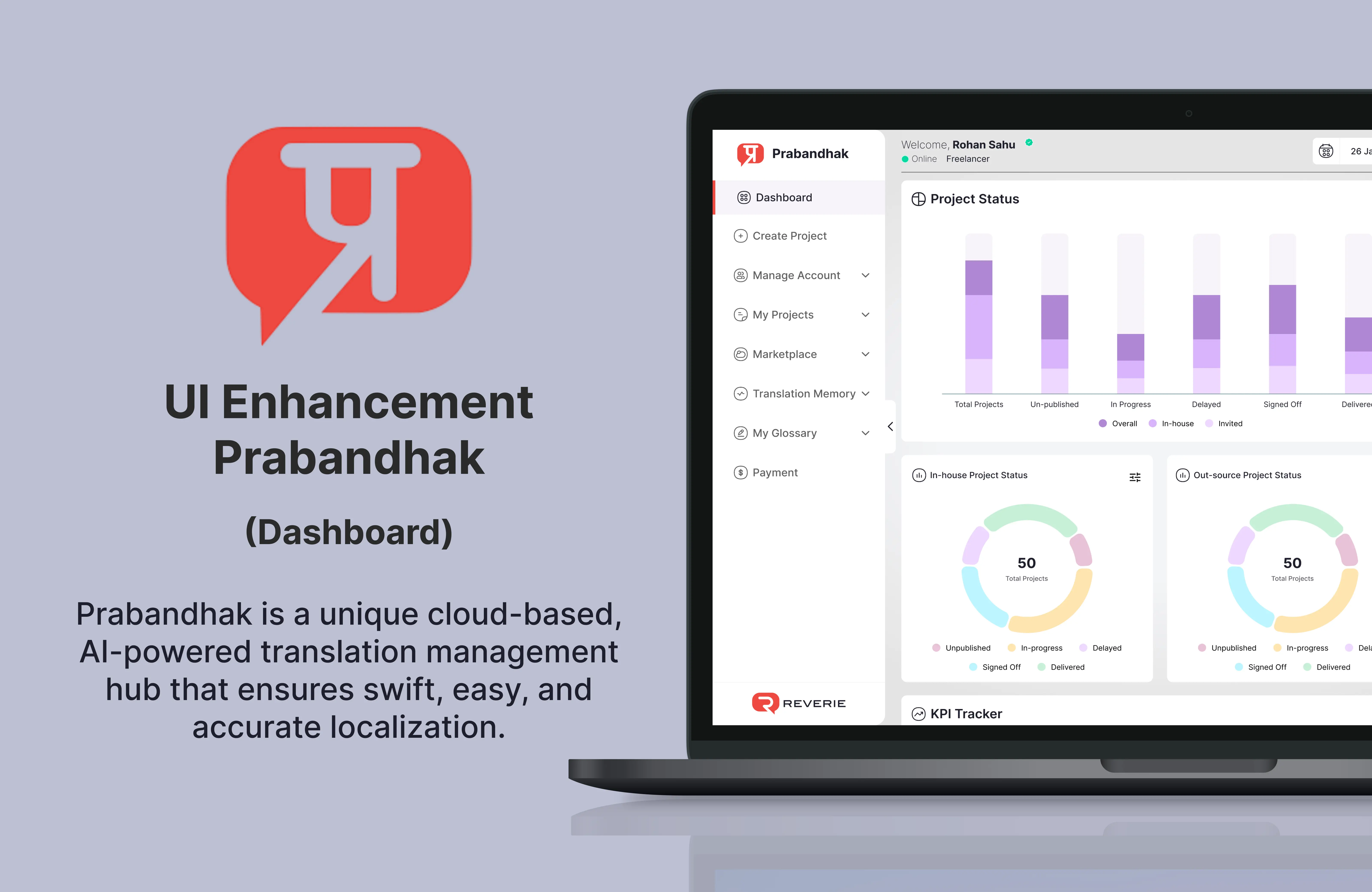
Prabandhak - AI-powered translation management hub
Prabandhak Cat Tool
Year
Client
Services
Project
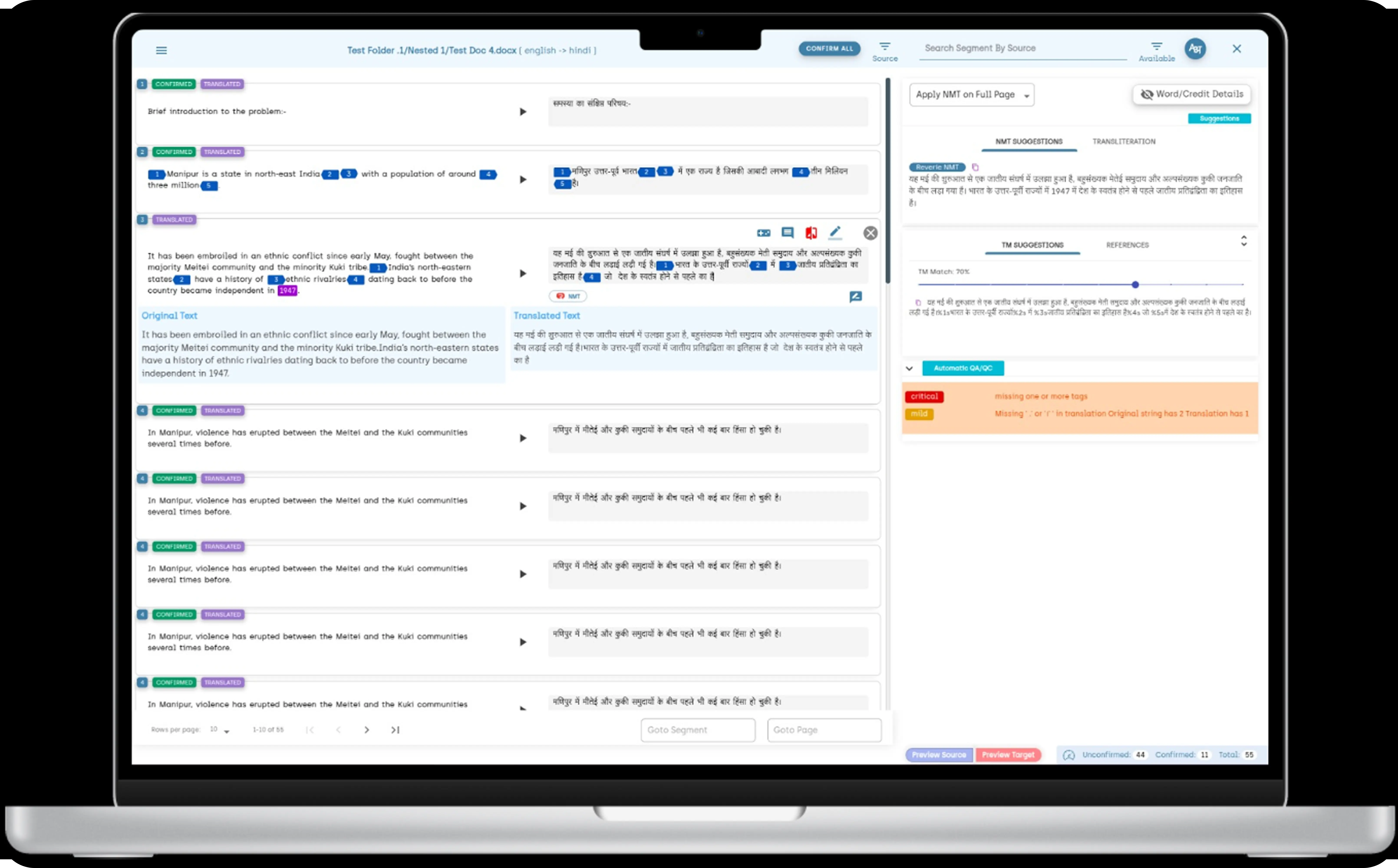
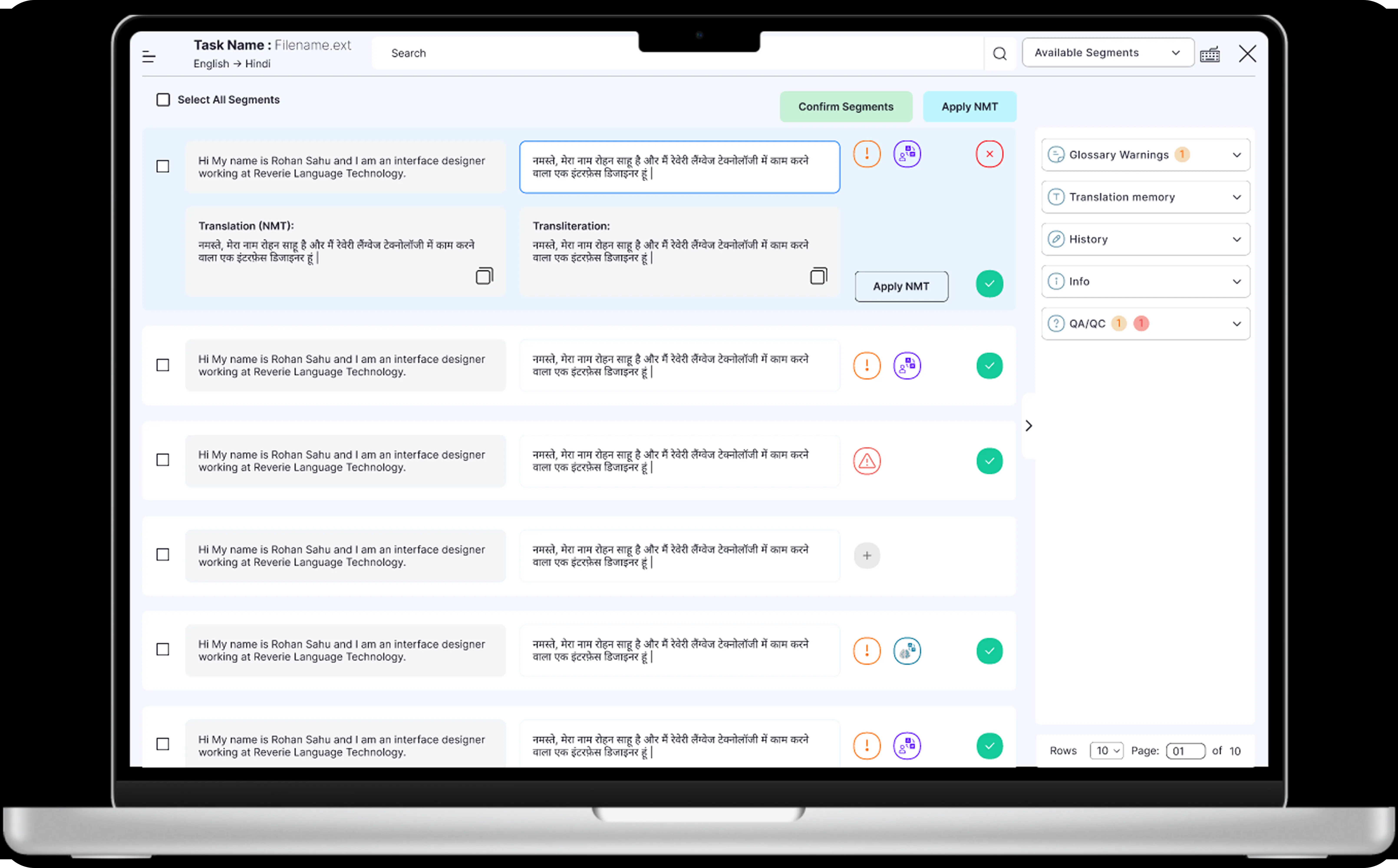
As part of the Prabandhak platform revamp, I redesigned the CAT Tool to enhance the translation workflow and reduce cognitive load for linguists. The original interface was cluttered, lacked contextual relevance, and failed to support an efficient translation-review cycle. Through user interviews and task analysis, I identified pain points such as poor segment navigation, inadequate TM (Translation Memory) integration, and inconsistent UI behavior across modules. I restructured the layout to focus on clarity and ease of use—introducing side-by-side source-target segment views, inline suggestions from TM and MT (Machine Translation), and contextual comment threading for better collaboration. I also implemented smart keyboard shortcuts and visual cues for QA checks to improve speed and accuracy. Post usability testing, the redesigned CAT tool demonstrated notable improvements in translation turnaround time, and accuracy.
The old Prabandhak CAT tool interface suffered from a cluttered and visually overwhelming layout, making it difficult for users to focus on translation tasks. Repetitive segments, poor contrast in status labels, and inconsistent icon usage created cognitive overload and hindered readability. The lack of a strong visual cue for the active segment often led to user disorientation during navigation, while cramped layouts wasted valuable screen space and disrupted the translation-review flow.
Additionally, the right-side panel was disorganized, with QA alerts and suggestions buried in poorly structured sections, reducing their discoverability. The absence of advanced filtering in the search bar limited productivity for users handling large volumes of segments. Critical tools like QA feedback were not emphasized effectively, and the interface failed to adapt to different user roles, offering no role-based customization or simplification for translators versus reviewers. Overall, the experience lacked clarity, efficiency, and focus.
What is wrong with the old design?
Issue: Dense arrangement of segments, buttons, and panels.
Impact: Increases cognitive load and reduces readability for translators and reviewers.
Issue: Lack of strong visual cues for the currently selected segment.
Impact: Users often lost track of their position, breaking task continuity.
Issue: Confirmed/translated tags were visually crowded and poorly placed.
Impact: Made it hard to quickly scan translation progress or verify segment state.
Issue: Inconsistent use of icons without supporting text.
Impact: Users had to guess icon functions, slowing down task execution.
Issue: Suggestions, warnings, and QA data were unstructured.
Impact: Users struggled to find relevant info, leading to missed errors or suggestions.
Issue: Similar font weights and colors throughout the UI.
Impact: No clear prioritization of key information or next actions.
Issue: Same interface shown for all users regardless of their function.
Impact: Created confusion and interface bloat for translators or QA reviewers.
Issue: No advanced filtering or targeted search options for segments.
Impact: Slowed down navigation and task management in large documents.
Issue: Cramped segment area but overly spacious sidebar.
Impact: Wasted screen real estate and led to excessive scrolling.
What is enhanced according to the requirments?
The tool must provide a clean, distraction-free interface with clearly grouped source-target segments. Active segments should be visually highlighted to guide users through the translation process with minimal confusion.
Essential actions such as "Apply NMT" and "Confirm Segments" must be contextually placed within the segment and use clear, unambiguous labels. Icons should be supplemented with tooltips or text to improve discoverability.
The right-hand panel must adopt a modular structure with collapsible sections (e.g., Glossary, TM, QA/QC) that users can expand based on their current task, promoting focus and reducing visual clutter.
The system must display quality warnings (QA/QC, glossary, missing tags) using consistent, color-coded visual indicators within each segment. These indicators should be interactive and allow users to quickly access details.
What is changed and its impact in new design.
Changed: Visually distinct active segment with a background highlight.
Impact: Keeps user oriented and focused on their current task.
Changed: Buttons are labeled and placed next to relevant content.
Impact: Reduces ambiguity and speeds up user decision-making.
Changed: Color-coded icons and warnings directly within segments.
Impact: Allows for quick recognition and resolution of translation issues.
Changed: Checkbox-based selection and bulk action buttons.
Impact: Boosts efficiency when processing multiple segments.
Changed: Clean visual grouping of source-target text with padding.
Impact: Improves scannability and reduces visual fatigue.
Changed: Glossary, TM, QA/QC grouped under collapsible headers.
Impact: Reduces distraction and supports focused workflows.
Changed: Differentiated font weights, colors, and segment states.
Impact: Aids comprehension of status, errors, and hierarchy of actions.
Changed: More functional top search bar with segment filters.
Impact: Improves navigation speed across large sets of data.
Changed: Better distribution of space across segment area and panel.
Impact: Reduces scroll fatigue and enhances user productivity.
Check out some of my design projects, meticulously crafted with love and dedication, each one reflecting the passion and soul I poured into every detail.
Reach out and let's make it happen ✨. I'm also available for full-time or Part-time opportunities to push the boundaries of design and deliver exceptional work.