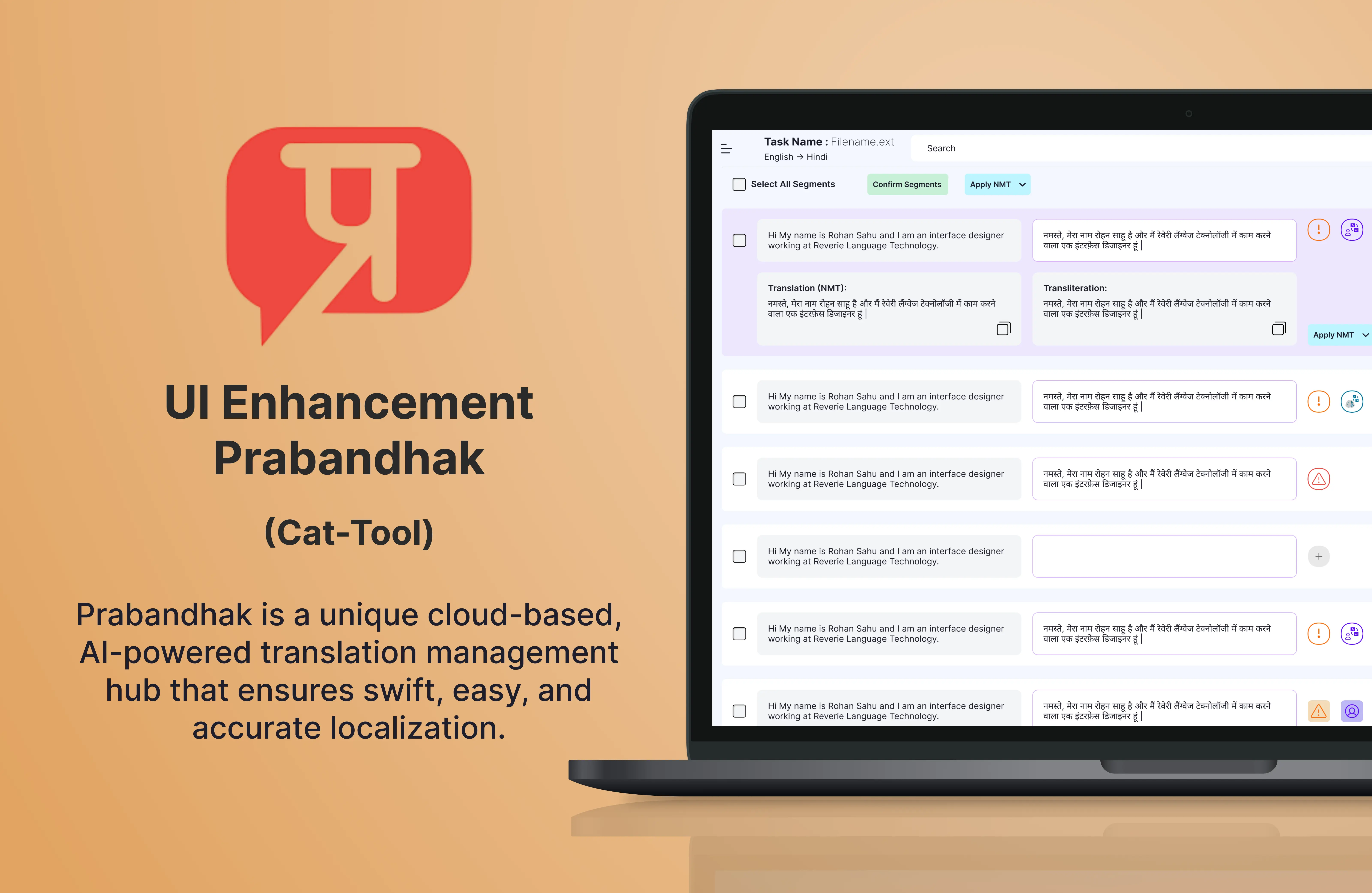
Prabandhak - AI-powered translation management hub
Year
Client
Services
Project
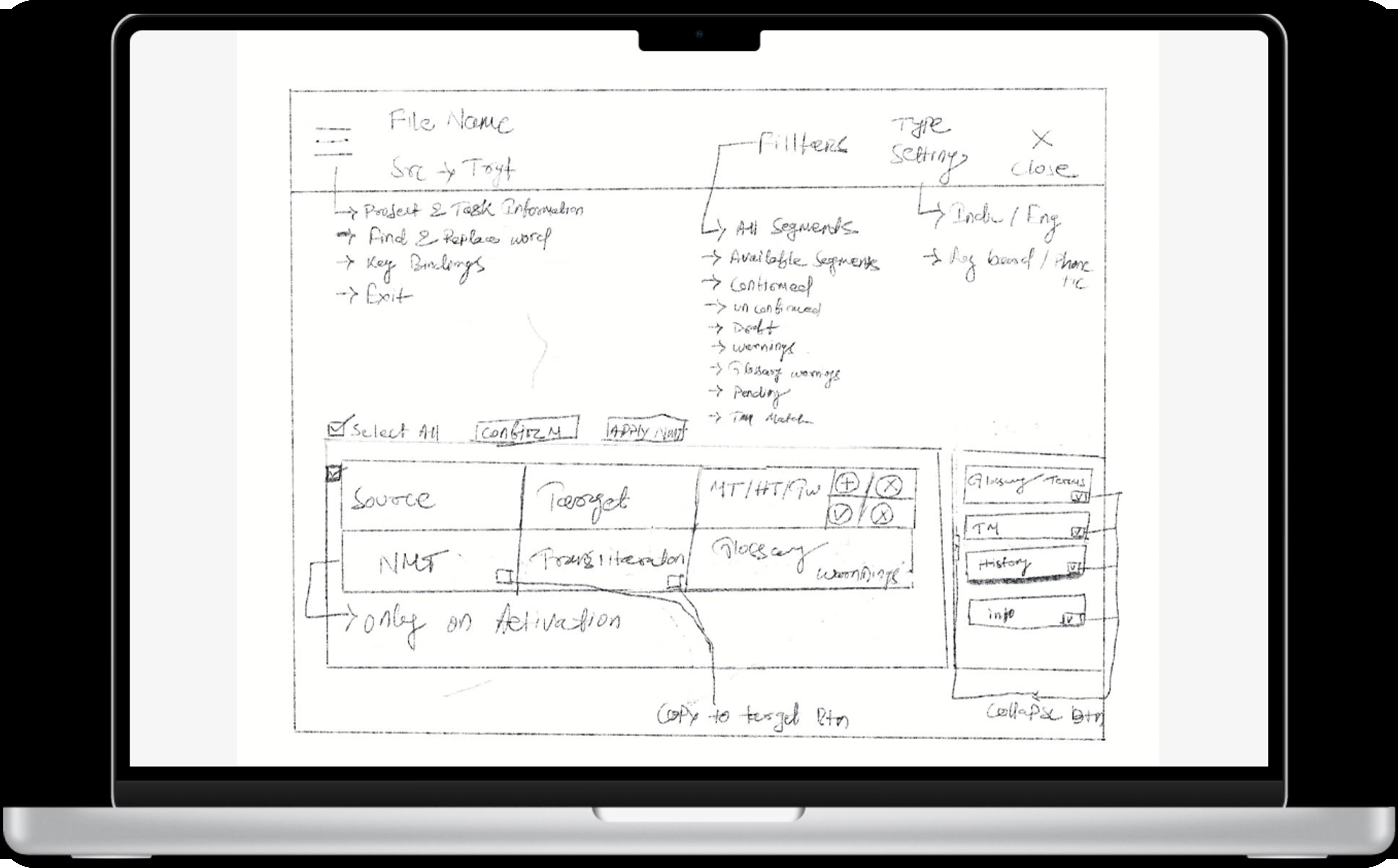
As part of the Prabandhak platform overhaul, I redesigned the dashboard to streamline project management and improve the user experience for translators and administrators. The original interface lacked visual clarity and presented scattered workflows, leading to confusion and inefficiencies in navigating tasks, translation status, and deadlines. Through in-depth user research and interviews, I redefined key user personas and restructured the information architecture to align with real-world workflows. The redesigned dashboard features a cleaner layout, intuitive project grouping, and prominent status indicators, allowing users to track progress at a glance. I also introduced role-specific views and action shortcuts to reduce friction for both translators and project managers. Following usability and A/B testing, the updated experience proved significantly more efficient, enhancing both productivity and user satisfaction.
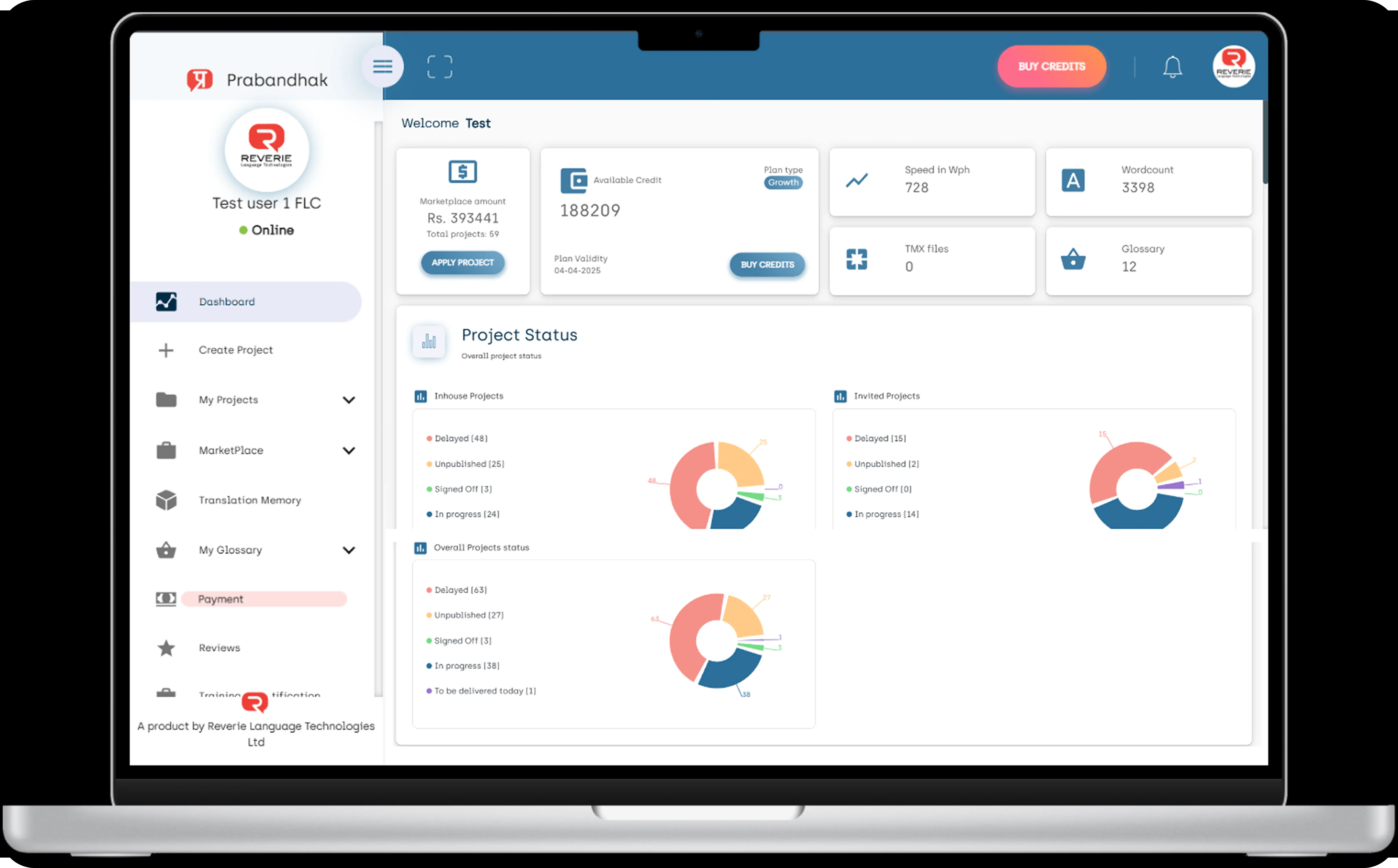
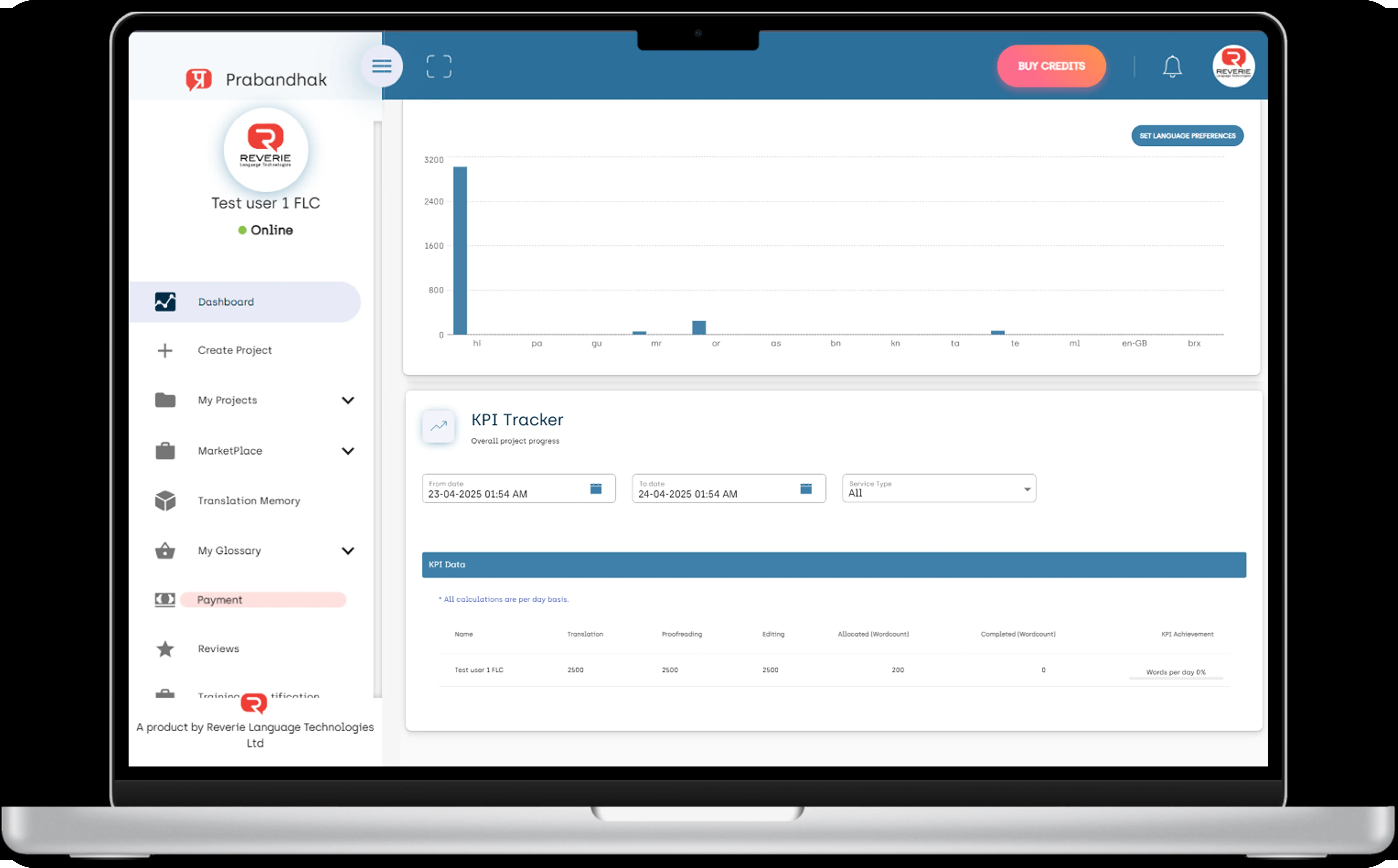
The old dashboard faced major UI/UX challenges, including a cluttered visual hierarchy and poor information grouping, making it overwhelming for users. Important CTAs like “Buy Credits” were not visually prioritized, and excessive use of similar-looking cards diluted focus. Charts were basic, lacked interactivity, and featured unclear labels, while inconsistent color usage reduced accessibility and quick understanding.
Navigation was inefficient, with a long ungrouped sidebar and no easy way to collapse sections, making it tedious to browse. Additionally, the dashboard lacked personalized insights, smart recommendations, and responsiveness for mobile users. Redundant headings and uneven spacing across widgets further broke the visual flow, resulting in a static, non-intuitive experience that failed to guide users toward key actions efficiently.
What is wrong with the old design?
Issue: There was no clear visual priority. All cards and sections had equal prominence, overwhelming the user. Key CTAs such as “Buy Credits” and “Apply Project” were not distinct, and the excessive use of similarly styled cards diluted focus.
Impact: Users found it difficult to identify important actions, leading to confusion and inefficiency.
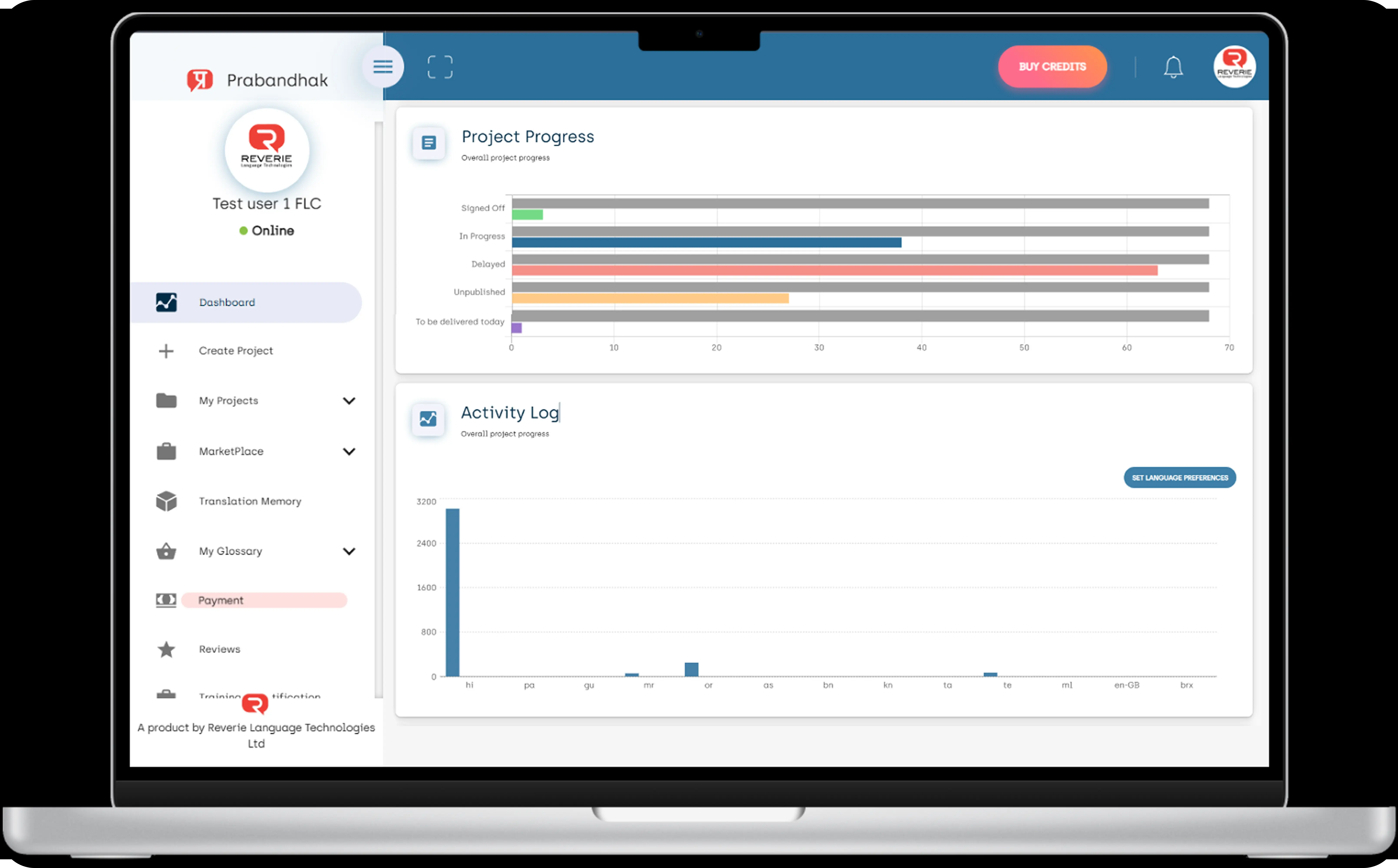
Issue: Information was displayed in a scattered and unstructured manner. Widgets such as KPI Tracker, Activity Log, and Project Progress were placed without any clear order. Repeated status indicators like "Delayed" and "In Progress" appeared in multiple sections, creating redundancy and cognitive overload.
Impact: Users struggled to identify which information was most relevant or required action.
Issue: There were inconsistent paddings between different sections and widgets. The tight vertical stacking of widgets contributed to a feeling of endless scrolling, and uneven text alignment disrupted visual flow.
Impact: The design felt cluttered and visually unappealing, making it harder for users to focus on the content.
Issue: The charts were basic and lacked interactivity. Pie charts were overused, and bar charts had unclear labels (such as language codes without legends), which made data interpretation difficult.
Impact: Users couldn't easily extract valuable insights from the charts, reducing the dashboard’s effectiveness in conveying data.
Issue: There was inconsistent application of status color codes (e.g., red for delayed, green for completed) across multiple sections. The color palette was also low-contrast, affecting accessibility.
Impact: It was challenging for users to immediately grasp the status of various elements due to color inconsistency and low visibility.
Issue: The dashboard presented raw data without any personalized insights, such as “Projects at risk” or “Upcoming deadlines.
Impact: Users were left to navigate through overwhelming data without any smart recommendations or priority alerts to guide them.
Issue: Sections with similar names, like “Overall project progress” and “Project progress,” were repeated without clear differentiation. Uniform heading styles added to the monotony.
Impact: The lack of variety in typography and section differentiation created confusion, making it difficult for users to scan the page effectively.
Issue: The sidebar was long and ungrouped, forcing users to scroll excessively to navigate. The “Payment” tab was highlighted in red, which could create unnecessary alarm.
Impact: The sidebar layout led to navigation inefficiencies and a sense of clutter, while color usage in the sidebar created confusion about the status of actions.
Issue: Important actions like “Buy Credits” and “Set Language Preferences” were not visually distinct, appearing secondary due to their muted design.
Impact: Lack of visual prominence led to users overlooking key actions, impacting overall usability.
What is enhanced according to the requirments?
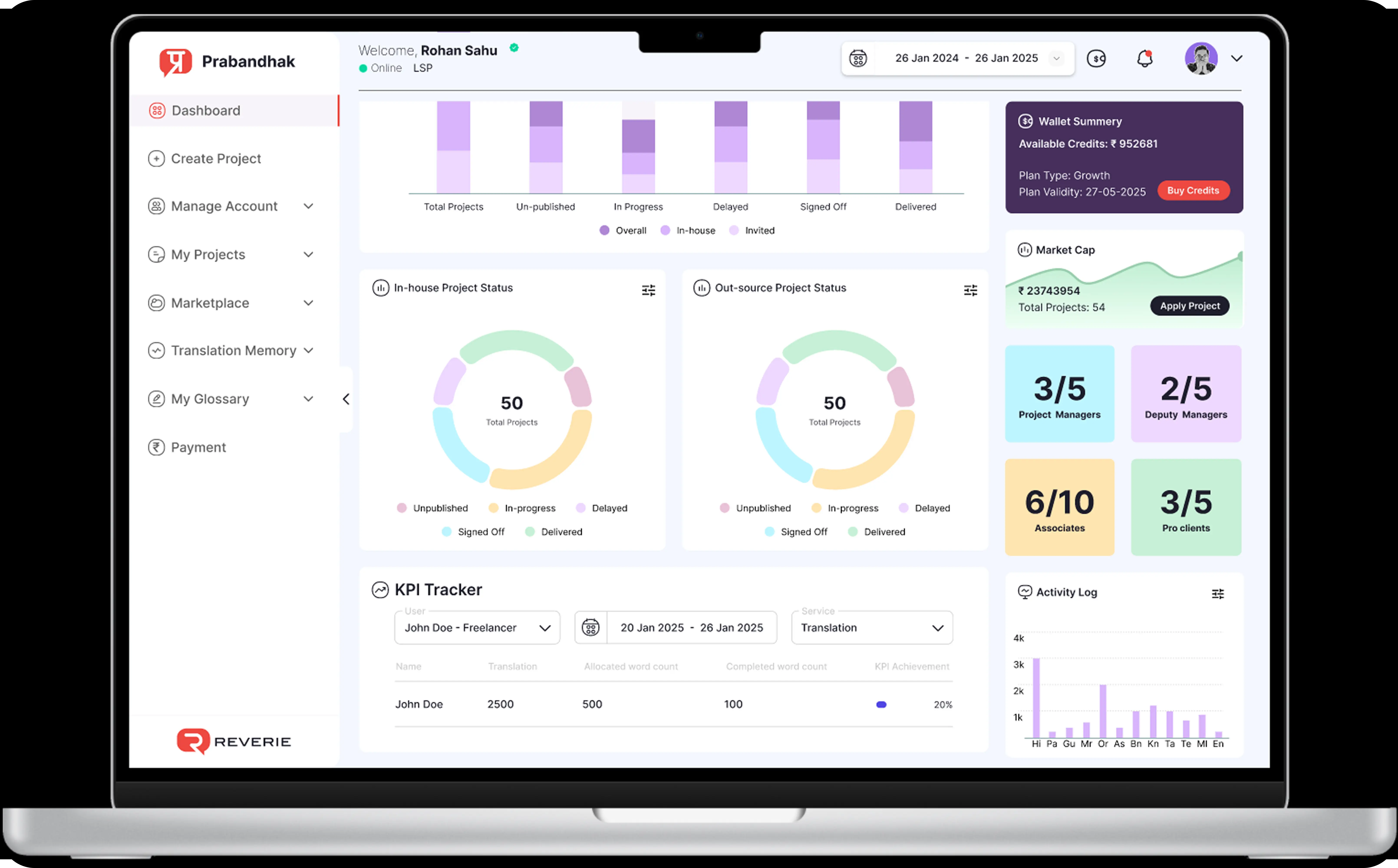
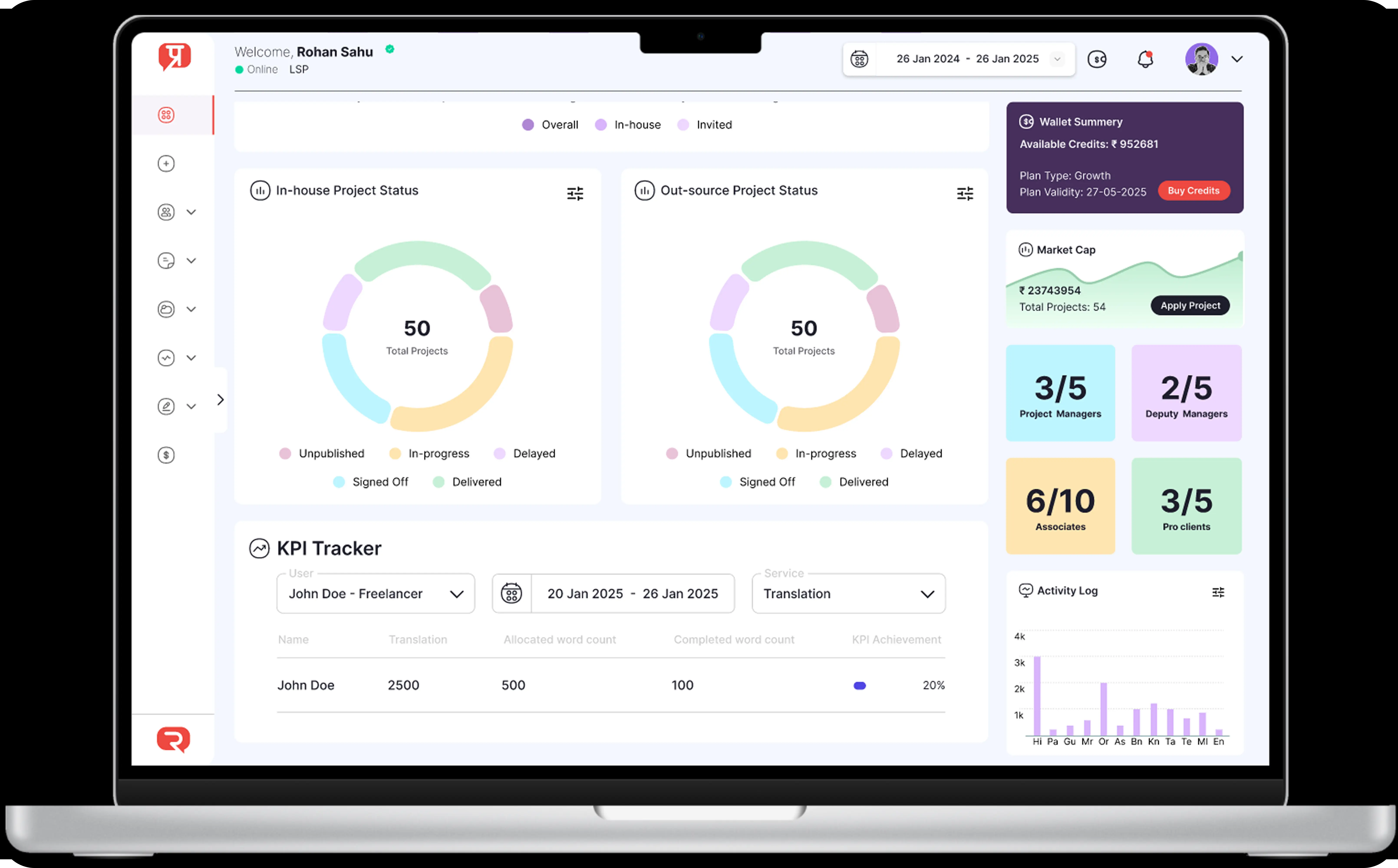
Important CTAs like "Buy Credits" are now highlighted through size, color contrast, and placement, helping users quickly find key actions.
Sections like KPIs, Project Status, and Activity Logs are now grouped logically with better flow, making it easier to scan and process information.
Each graph now includes date range filters, allowing users to customize the data view based on different time periods — improving insights and usability.
The redesign introduced consistent spacing, alignment, and stronger color usage (with proper legends for status indicators), making the dashboard cleaner and easier to navigate.
What is changed and its impact in new design.
Changed: The new design introduces clear visual prioritization by making key CTAs (like “Buy Credits” and “Apply Project”) more prominent through contrasting colors, bolder fonts, and strategic placement.
Impact: This enables users to quickly identify and take action on the most important tasks, reducing cognitive load and improving task efficiency.
Changed: Information is now grouped into clearly defined sections, with logical flows that make it easy for users to find what they need. Redundant information, such as repeated status indicators, has been minimized.
Impact: The clear categorization and hierarchy of information make the dashboard feel more intuitive, reducing confusion and mental fatigue.
Changed: The redesign ensures consistent padding and alignment between all sections and elements. There is better use of white space to break up dense areas of content, and sections are now better spaced to avoid a crowded, endless scrolling effect.
Impact: The more spacious and consistent design improves readability and visual comfort, helping users focus on the content without feeling overwhelmed.
Changed: Charts are now interactive with hover states and clearer labels. Pie charts have been reduced in favor of more readable and data-rich visualizations. Bar charts now have clear legends and full-text labels for ease of understanding.
Impact: The new charts provide users with clearer insights and better data exploration, increasing the overall utility of the dashboard.
Changed: A refined color palette with higher contrast has been applied, ensuring better accessibility. Status indicators are now consistently applied across the dashboard, with clear legends for reference.
Impact: The improved color scheme enhances the visibility and clarity of status information, making it easier for users to grasp the status of key elements at a glance.
Changed: The redesigned dashboard introduces personalized insights such as “Projects at risk,” “Upcoming deadlines,” and performance summaries.
Impact: Users now receive tailored, priority-based recommendations that help them focus on the most important tasks, enhancing their overall experience and productivity.
Changed: Section titles are now differentiated with varied font sizes, weights, and styles, and redundant labels have been eliminated.
Impact: Clearer, more distinct headings allow for faster scanning and navigation of the content, improving the overall efficiency of the dashboard.
Changed: The sidebar has been reorganized with collapsible sections, reducing the need for excessive scrolling. Visual indicators and icons help users quickly navigate to their desired sections.
Impact: The improved sidebar layout provides a more fluid navigation experience, making it easier for users to switch between sections without feeling lost.
Changed: CTAs now stand out with more prominent designs, incorporating hover states for interactivity. Important buttons like “Buy Credits” and “Set Language Preferences” are now easily recognizable.
Impact: This enhances the overall usability of the dashboard by making key actions more accessible and reducing the chances of users overlooking important tasks.
Check out some of my design projects, meticulously crafted with love and dedication, each one reflecting the passion and soul I poured into every detail.
Reach out and let's make it happen ✨. I'm also available for full-time or Part-time opportunities to push the boundaries of design and deliver exceptional work.